Client ::
Tractor Beverage Co.
Overview ::
When the founding team of what would become Tractor Beverage Co. came together to grow an organic beverage company, they committed to doing things right. That meant being real to the last drop—everything from keeping their commitment to no artificial ingredients to partnering with a creative studio that was fully aligned with their vision of what better beverages can represent.
As we dug into the Tractor brand strategy, a realization rose to the surface that laid the foundation for what Tractor would become. Yes, Tractor Beverage Co. was the first certified organic and non-GMO food service beverage solution, but just as important, the folks at Tractor understood that food and drink have an important and meaningful relationship and history. In other words, because food matters so much—drinks matter. We determined early on that table drinks can be a complement, an extension, and a catalyst to carry overall dining experiences to the absolute peak of flavor, enjoyment, and satisfaction. From there, we got to work.
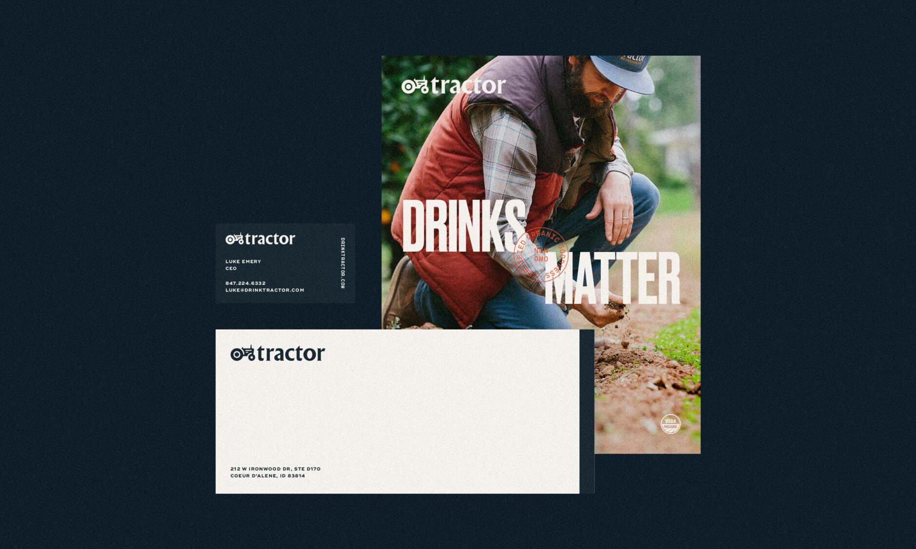
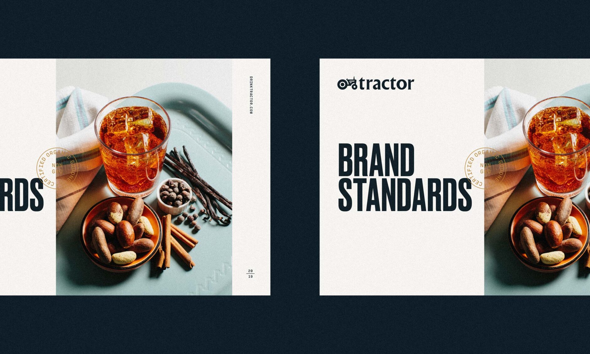
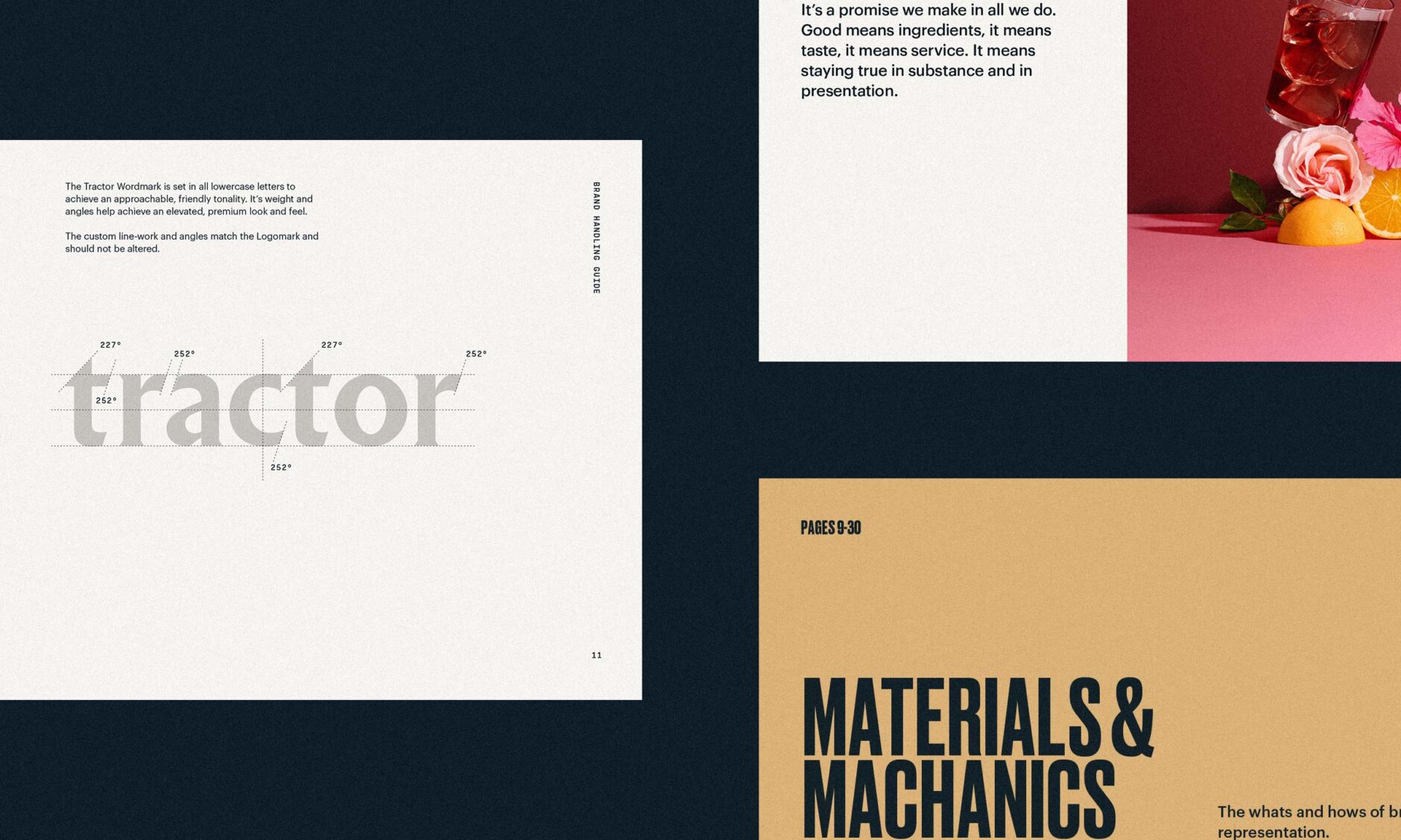
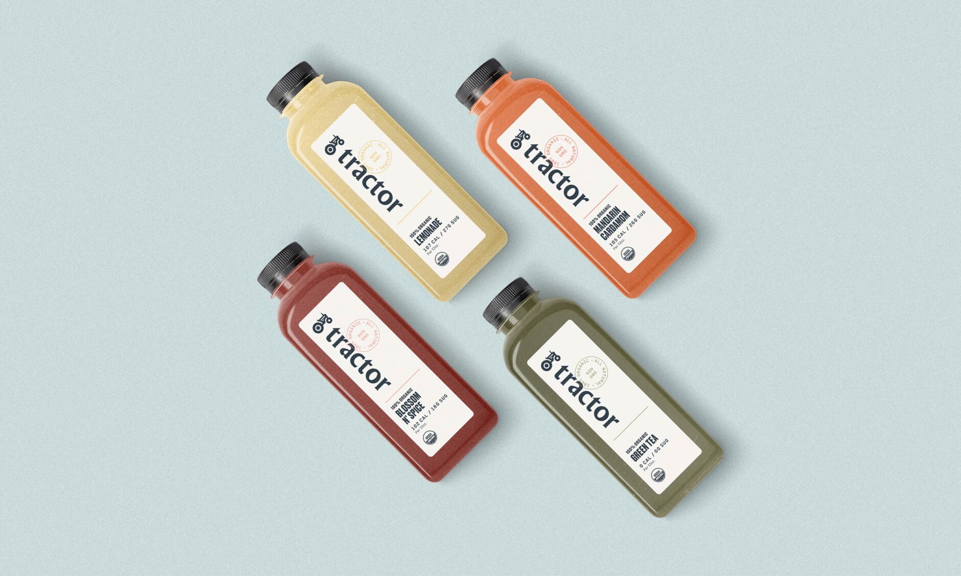
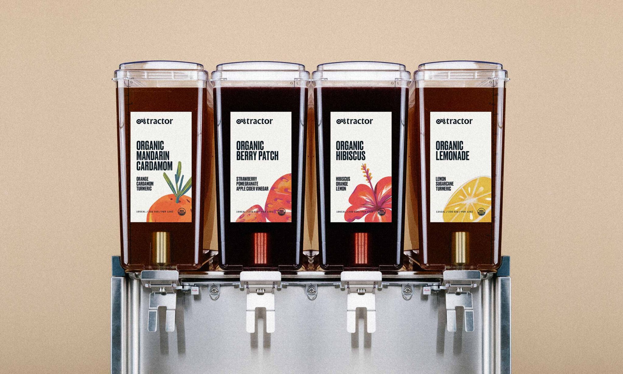
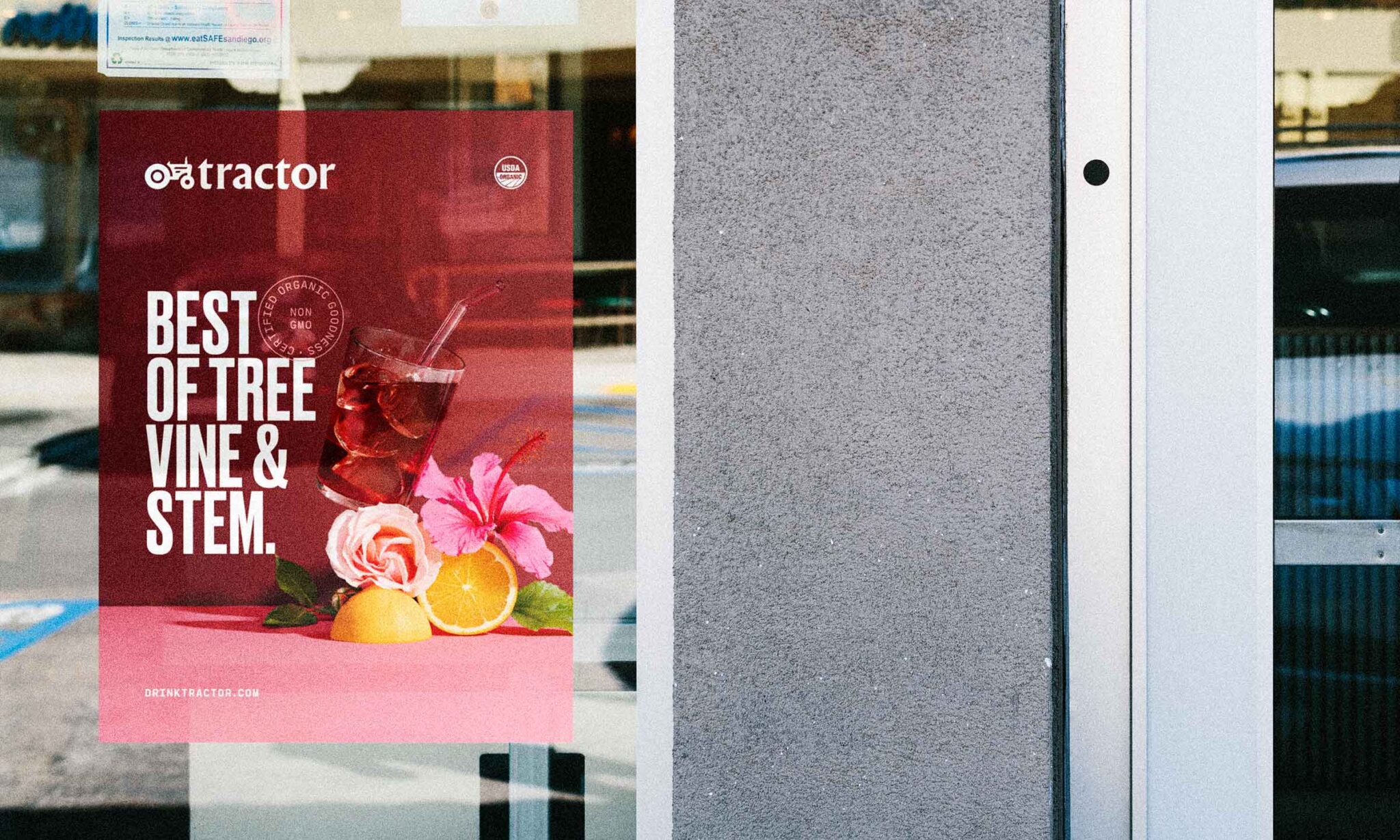
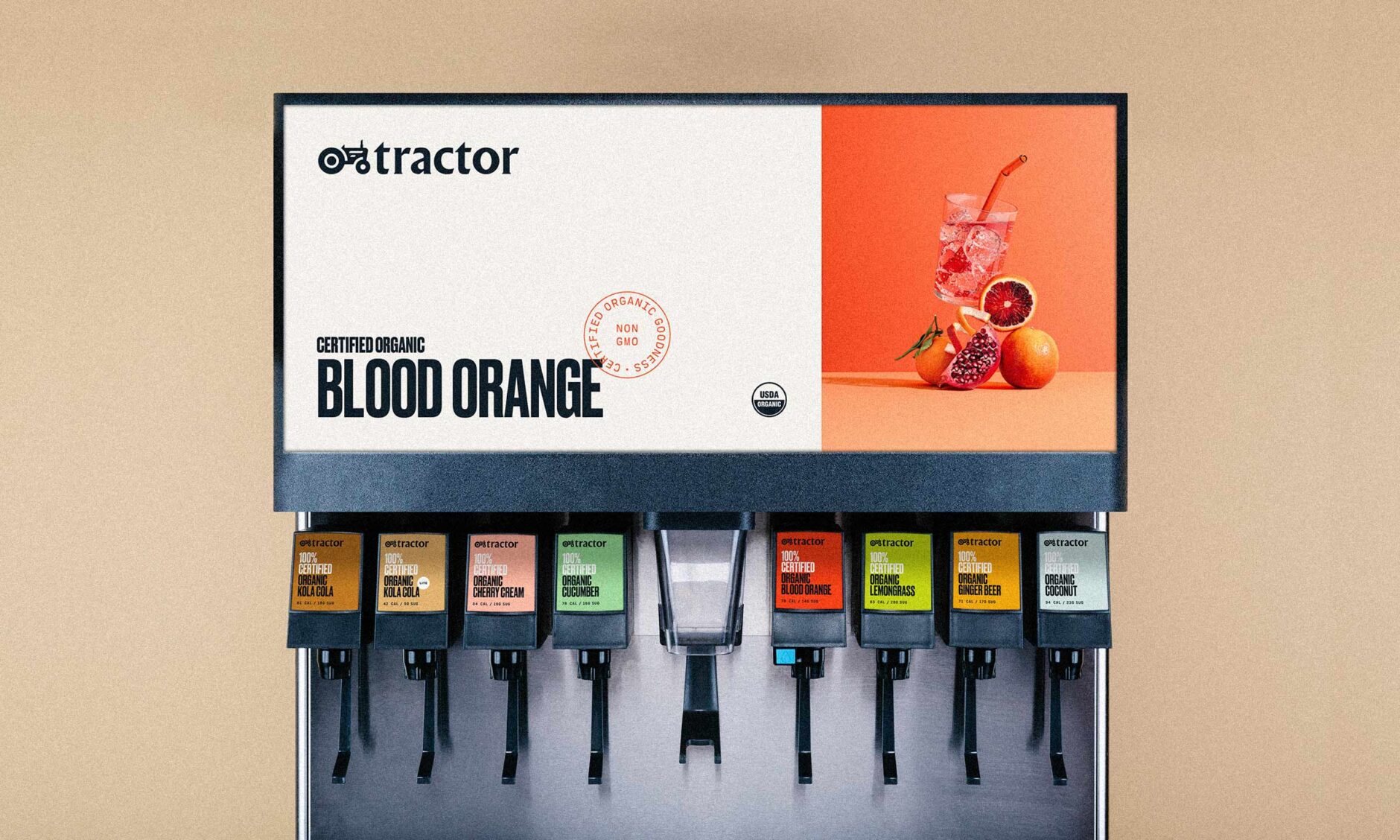
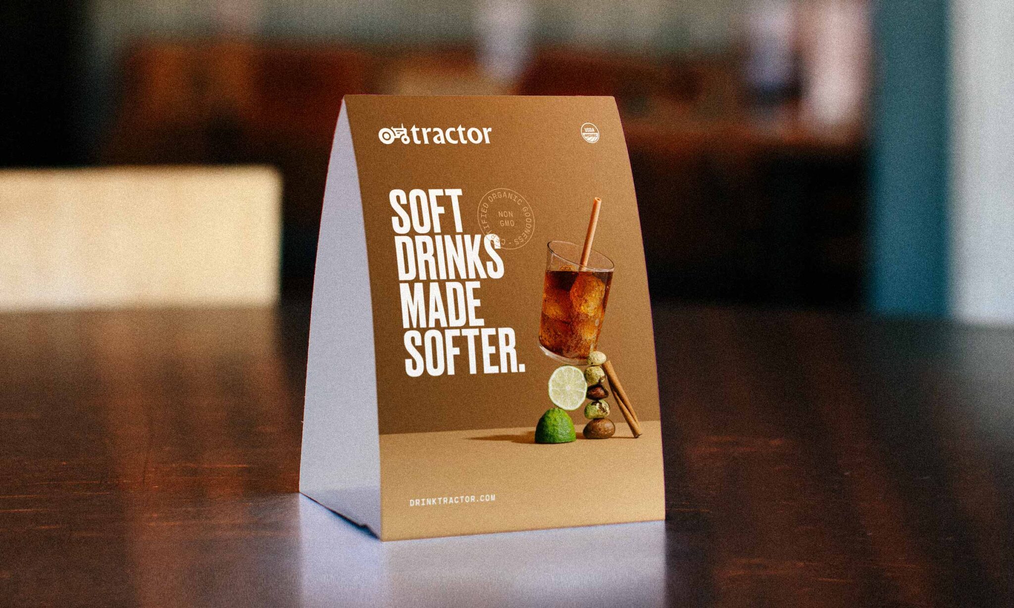
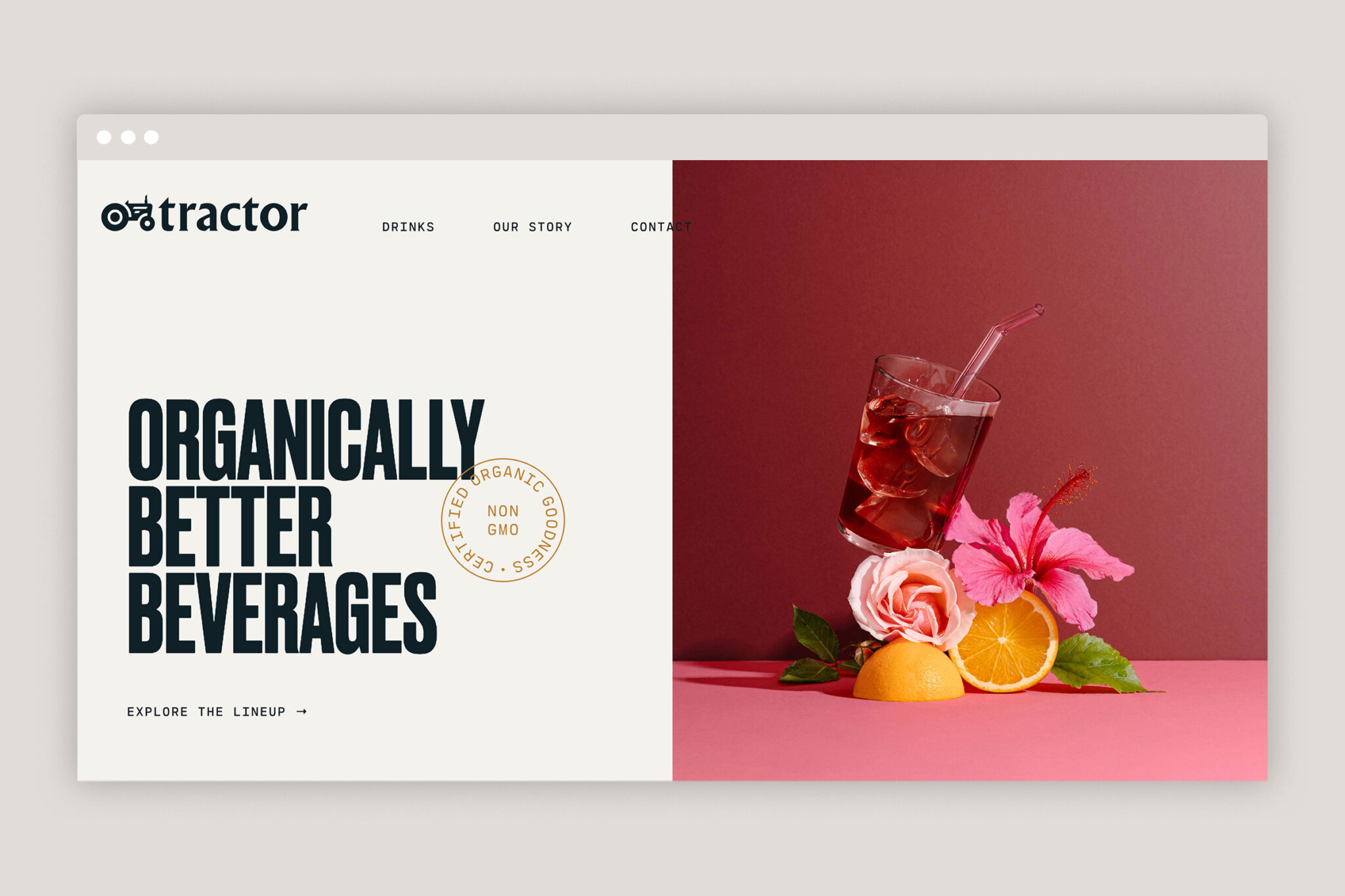
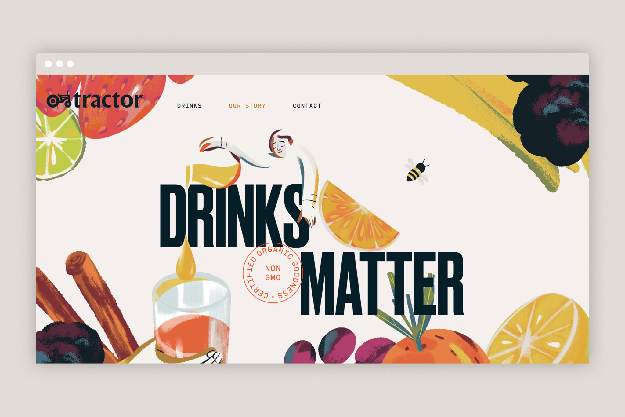
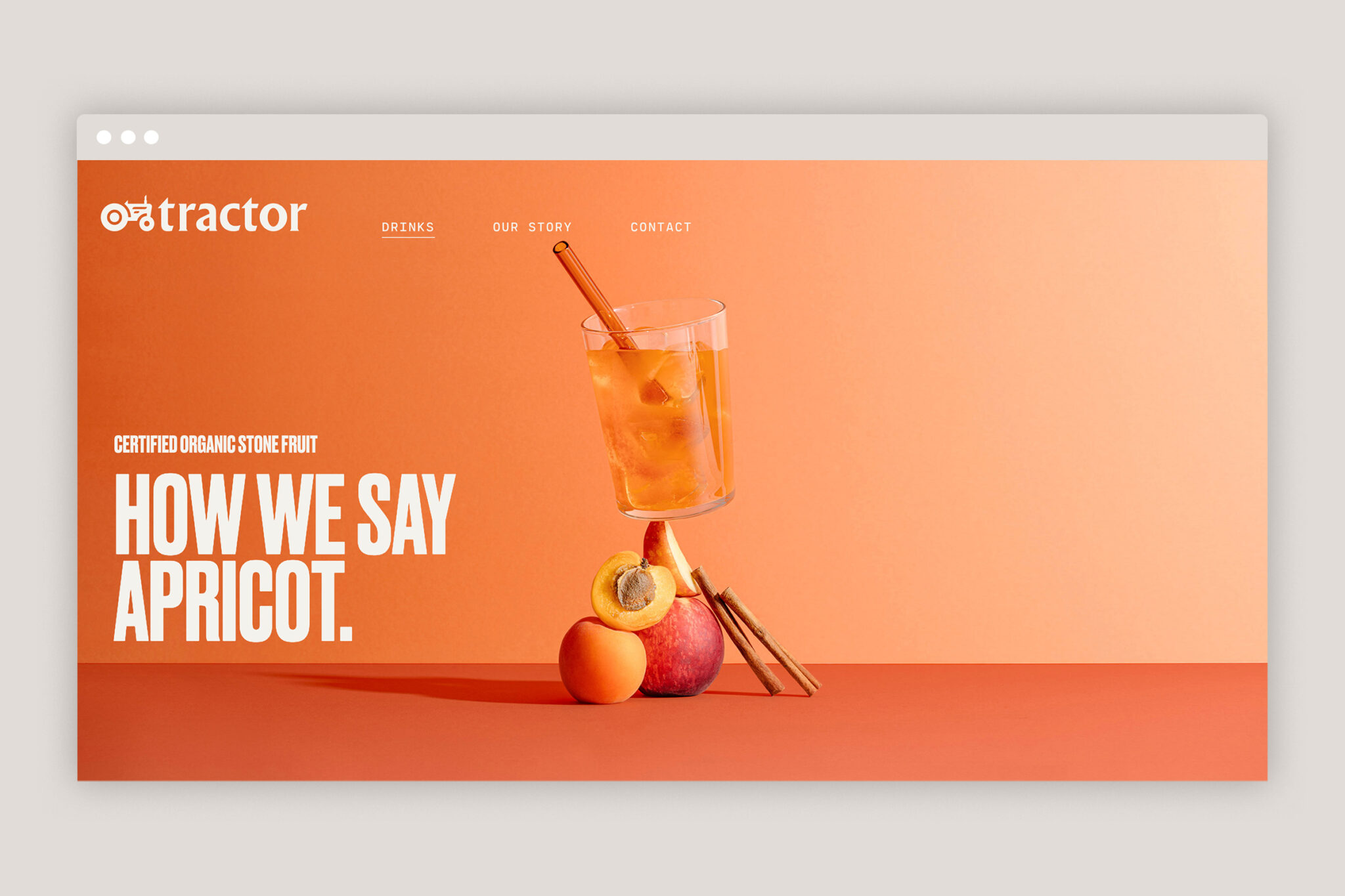
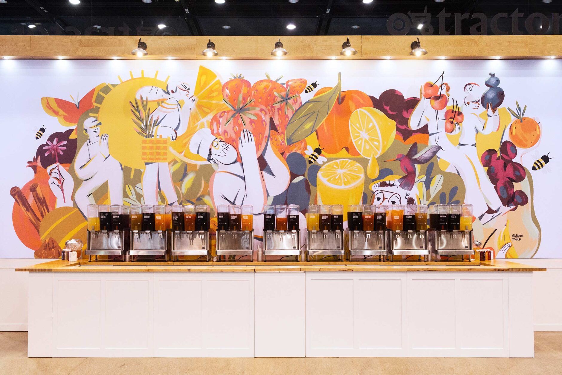
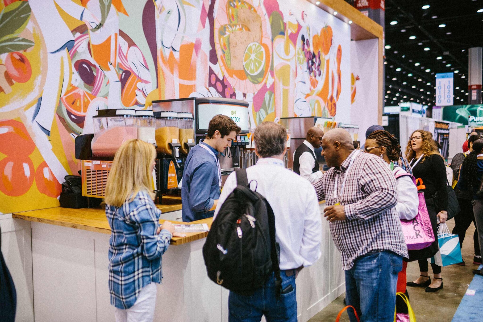
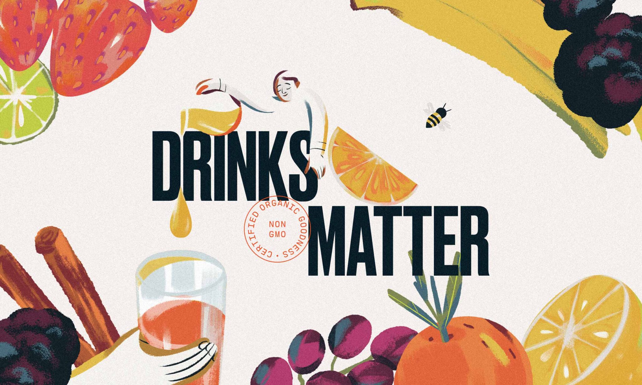
When developing the visual system for Tractor, we sought to craft a lasting, flexible design system that conveys a premium experience with a nod to heritage. We worked to achieve a balance that feels simple but elevated, accessible but not too cute, all while establishing a bold presence that is always inviting. Intentionally stripping back the fluff and conveying transparency was intentional to show what matters most—the ingredients. With clean lines, strong type, and impeccable photography, we’ve found a visual language that resonates with Tractor’s audience and honestly reflects the deeper aspects of this brand’s unique characteristics.
Industry ::
Food & Beverage
Date ::
2021–2022
Our Involvement ::
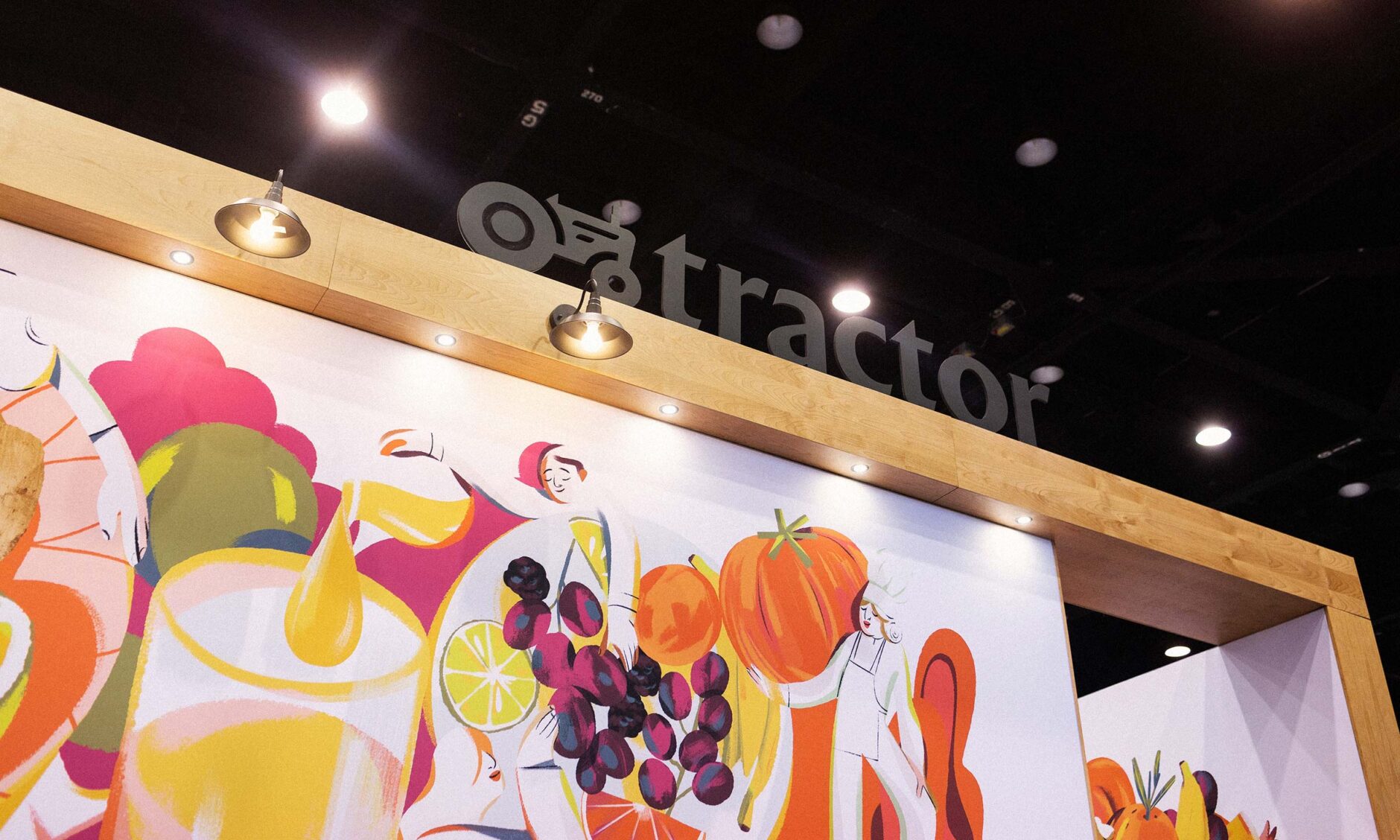
Core Identity Development, Brand Architecture Design, Photography, Website Design & Development, Trade Experience & Design, Advertising Campaigns, Social Strategy & Content Creation
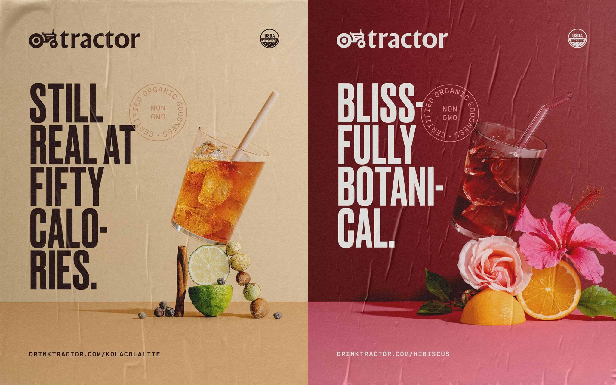
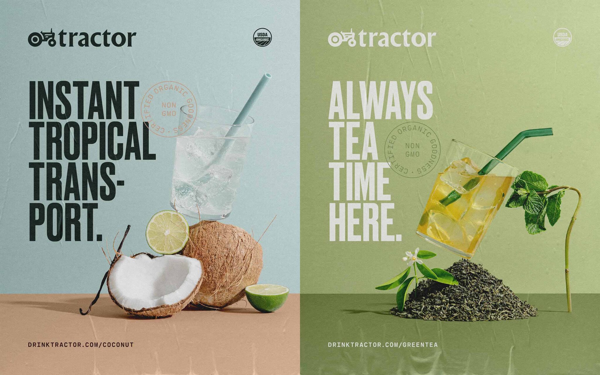
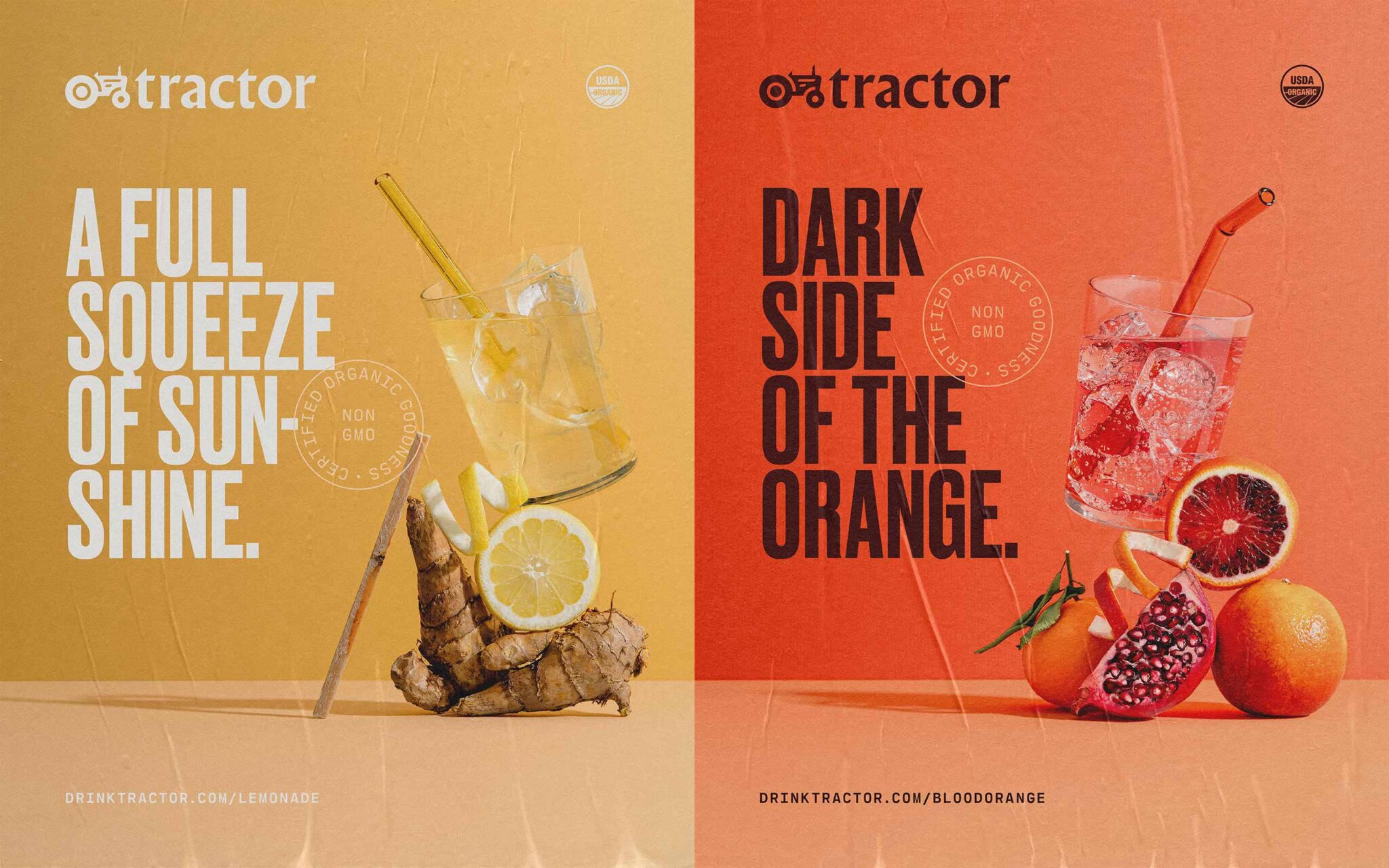
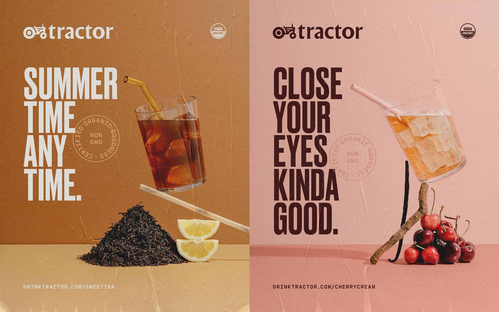

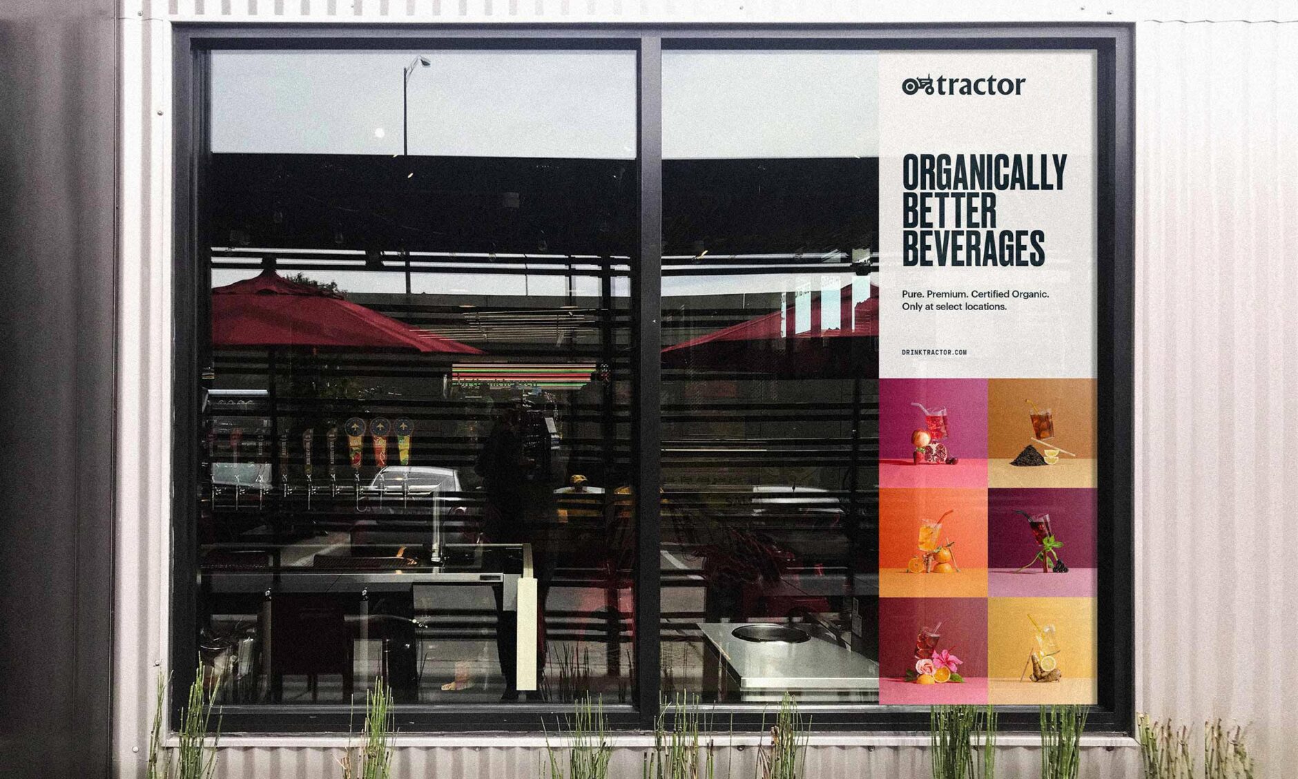
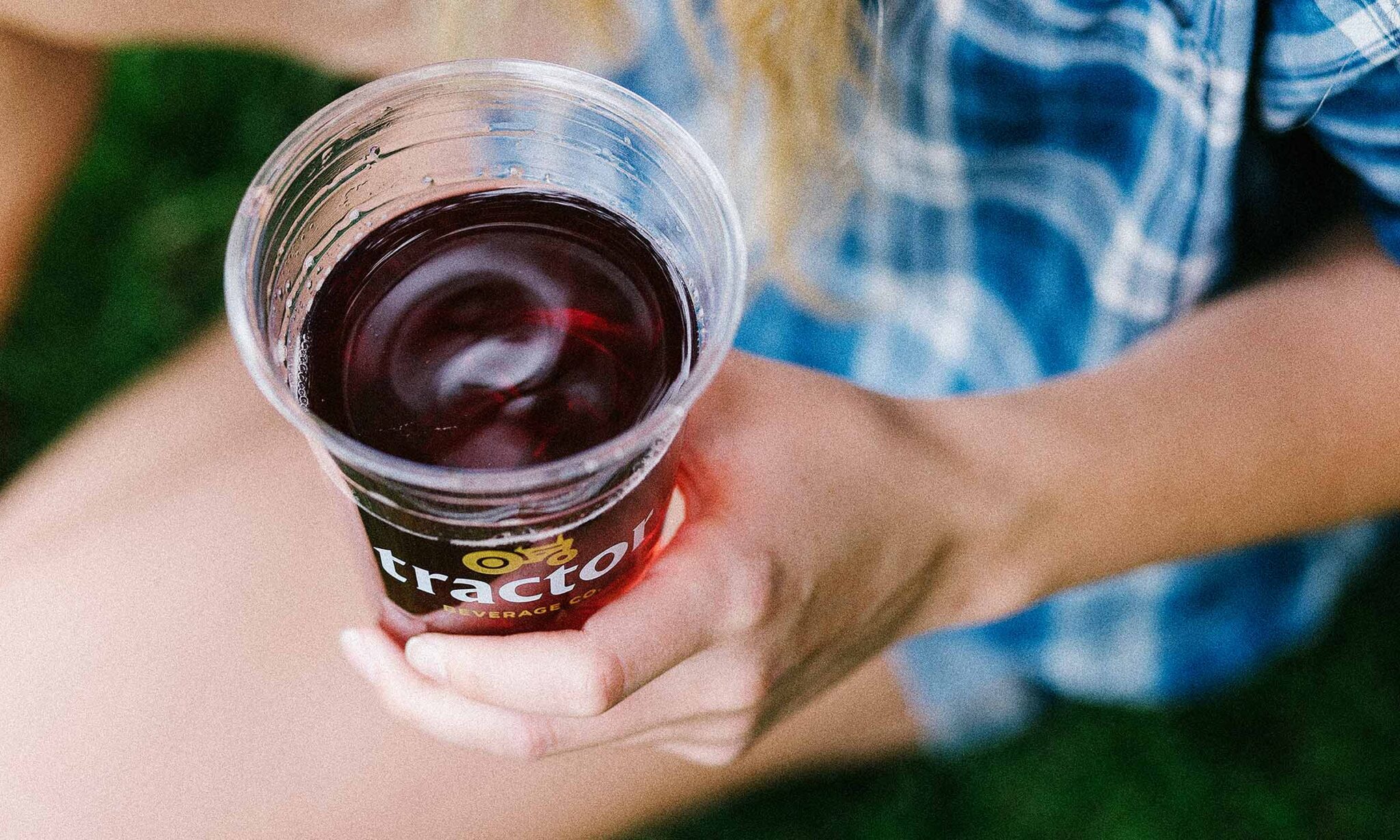

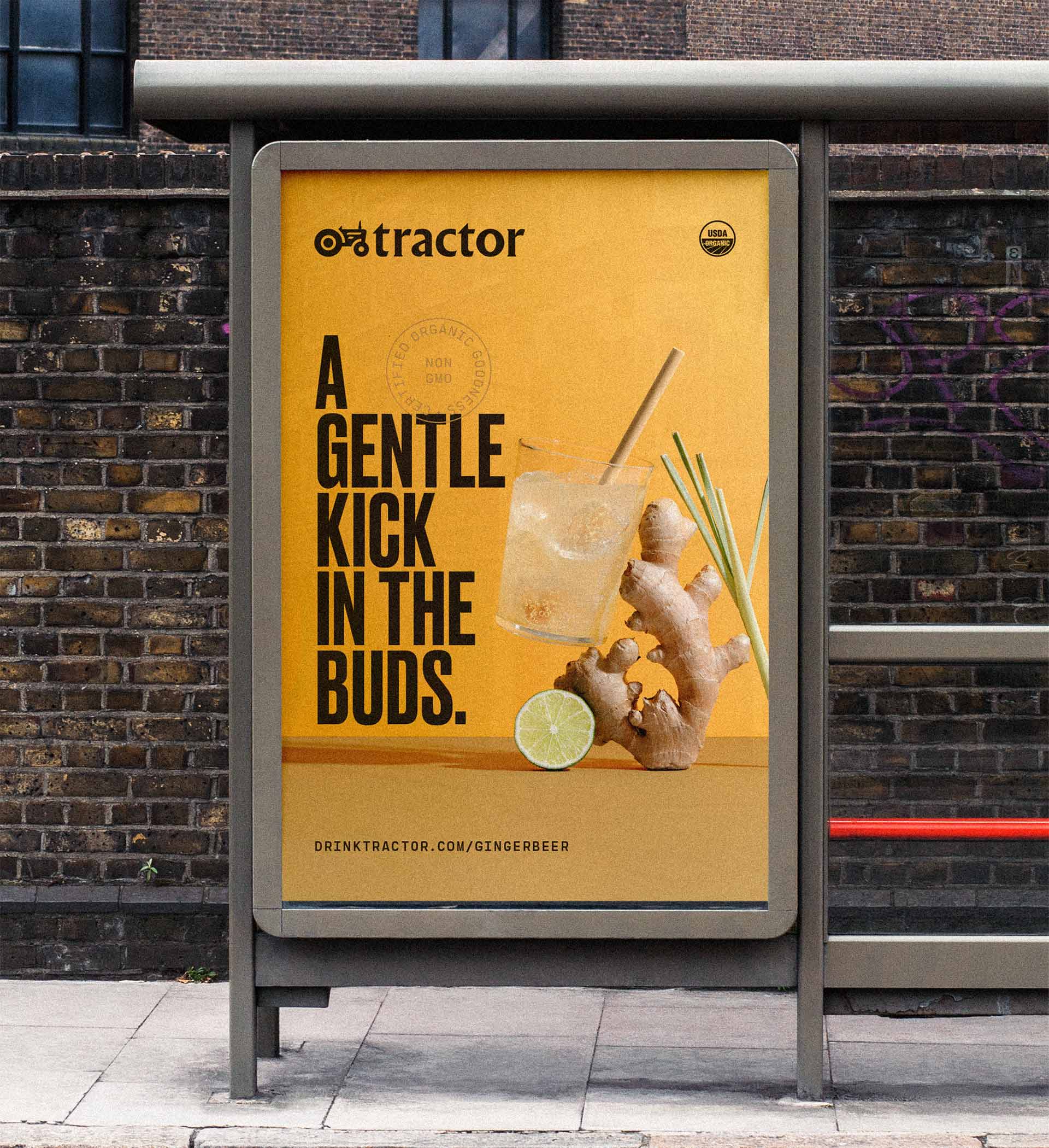
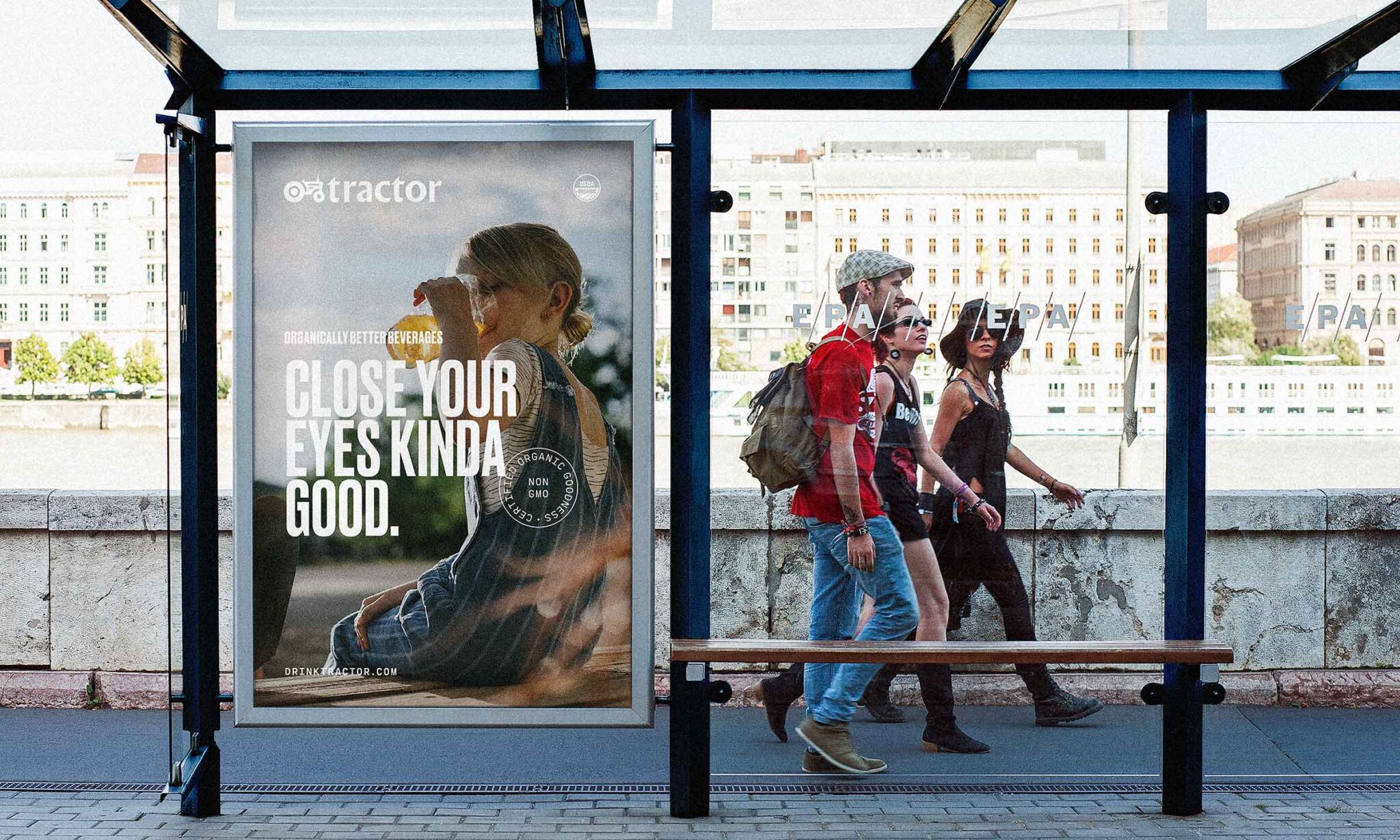
“Bondir has become much more than a business partner—we have formed a lasting relationship as they have truly become an integral part of our Tractor family. We would not be where we are without them. They are some of the finest people I have ever worked with in my career. Bondir’s work speaks for itself, but it is the people behind it that make them as phenomenal as they are. They are simply the best.”
— Luke Emery, Chief Growth Officer

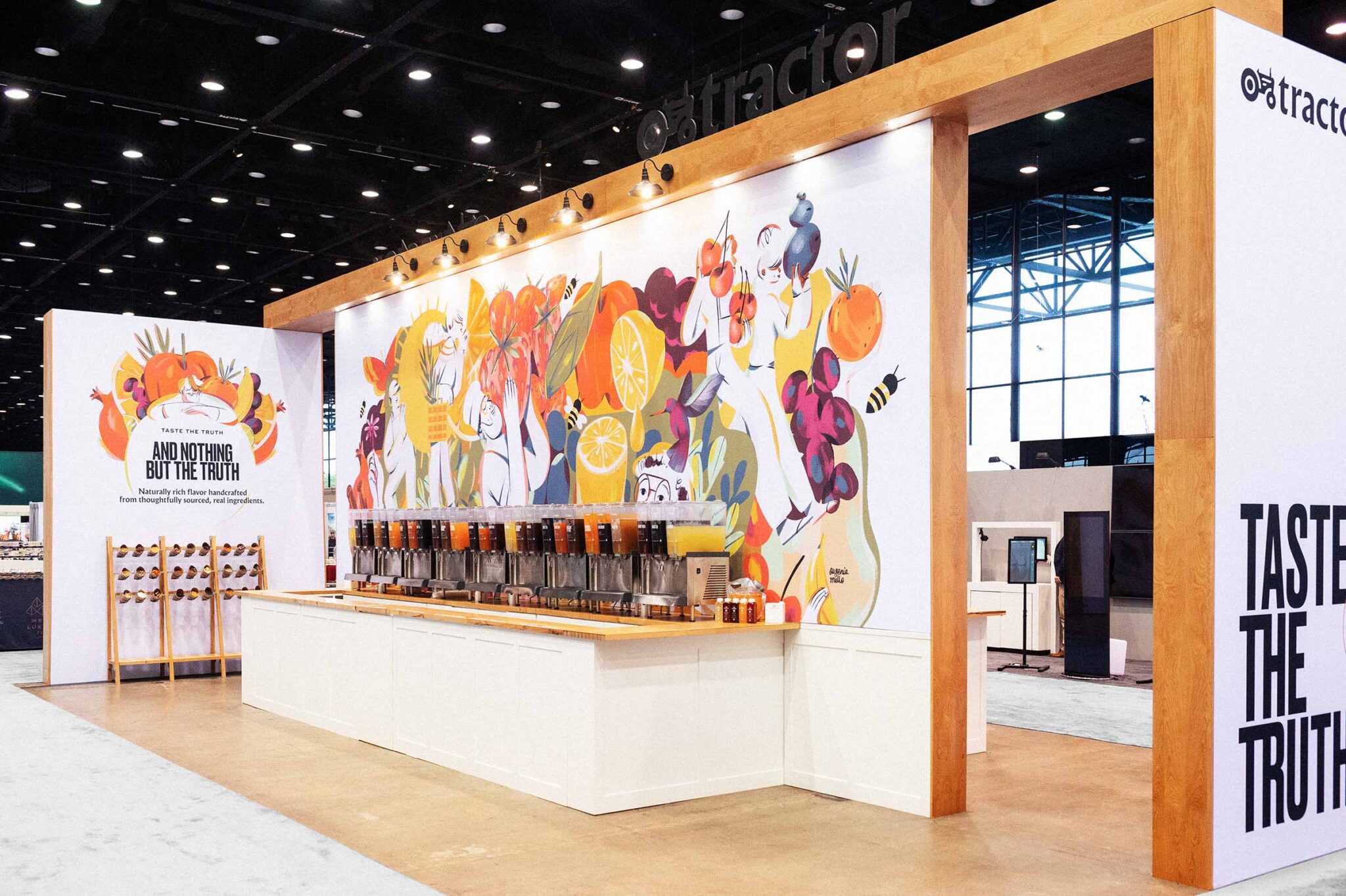
“I am just now realizing the sublimity of Bondir design and word-smithing. The lines, the power of simple complexity, letting the ingredients show through. I am sort of at a loss for words. It evades description. Tractor is just more real now than it was before Bondir entered the picture.”
— David Nicksic, Senior Account Executive
©2023 Bondir, LLC.
Bondir is an award winning identity and brand development studio.
Since 2017.
Brandworks—Get insights into our process, projects and other stuff we are up to.